Earlier this year Google announced that they would be adjusting their search algorithm to take a website’s ‘mobile-friendliness’ into account, meaning responsive sites could end up surging in popularity at the expense of their unresponsive competitors. This was positive news to early adopters of the responsive trend, but left those with unresponsive sites scrambling to come up with a solution before the changes took place, lest they be left in the Dark Ages with cassette tapes and dial up modems.
Last week we saw the search algorithm changes go live, so how might this impact you and your website? After all, it’s reported that up to 40% of Fortune 500 websites may be affected, so it’s certainly a change that’s going to shake up the online world.
There has been much debate about what mobile-friendly means, and Google have handily confirmed that a site must facilitate the following to avoid being impacted by the new changes:
- Contain text that is readable without tapping or zooming (16px is the recommended font size)
- Have tap targets that are appropriately spaced out for mobile users, to avoid mis-clicking
- Avoid horizontal scrolling
- Avoid unplayable content
Tick off all of the above and you’ve got yourself a site that’s easily used by a mobile user and will have a cheerful ‘Mobile-friendly’ tag when it’s brought up as a search result. To clarify, these changes will only be displayed when users search on their mobile device, not on a tablet or desktop.
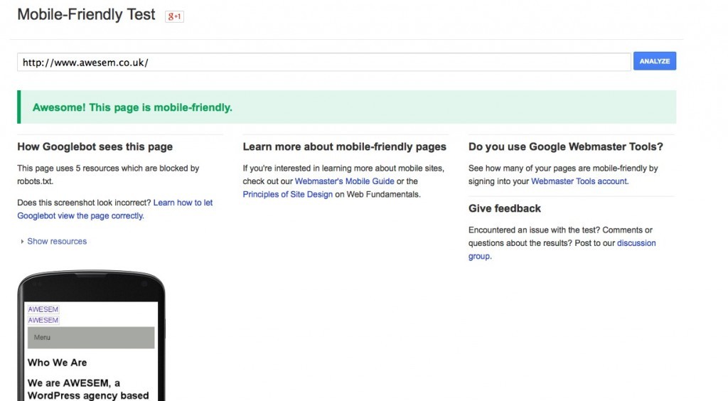
Google have released a ‘Mobile-Friendly Test’ tool, where you can plug in your URL and find out whether or not your page passes the test. If it doesn’t, there are handy hints you can follow to up your responsiveness and tweak your design to ensure it’s more mobile-friendly.
As you’d expect with such a major change, plenty of companies are releasing apps and tools to help site owners make the most of the changes and ensure their site performs well in Google’s rankings. CrossBrowserTesting feature a plethora of testing options, to help you view your site through numerous different devices to check it performs just the way you want it to – and the way that Google now expects it to.
Google have confirmed that they will use a variety of signals to rank search results, so sites that aren’t currently mobile-friendly but perfectly match your search terms would still show up as one of your top results.
Still, with so much of today’s browsing taking place on mobile devices, it makes sense for site owners to ensure their website performs just as well for mobile users as it does for desktop users – Google’s changes might not knock your site down the search results but it’s very likely that users will begin to avoid sites without the ‘Mobile-friendly’ tag, knowing that it won’t display as well as those with a responsive design.
If you’ve been dragging your heels, now’s the perfect time to update your site and make those little tweaks to your design that could make all the difference to whether or not your site is considered mobile-friendly. Get in touch with us today via our Contact page an we can discuss how our team can ensure your site is responsive and mobile-friendly.


